The case for null in design systems

Horror vacui and empty spaces
Let’s take a moment for a brief art history lesson to help understand this discomfort.
Horror vacui is a term used in art history. Translated from Latin it means, “fear of empty space,” and it focuses on artistic works where empty or negative space is compulsively filled with detail. This aesthetic was a technique to help frame an image’s main content and be an observable measure of effort the artist expended.
In a contemporary context, horror vacui deals with class divide and perception of value. Experiences full of material are viewed as low-end, while experiences with minimal content are viewed as high-end. So what does this mean in terms of a design system?
Zero, undefined, and null
There’s some nuance involved in quantifying the absence of something to be able to talk about it accurately. For this, we have the concepts of zero, undefined, and null.
Zero is an interesting number. It represents not having any amount of something, and it took some time as a species for us to psychologically come to terms with it.
Undefined means something has yet to be assigned a value. It can be intentional or accidental. I might give you 50 of a thing, but it hasn’t happened yet. Or I forgot to give you 50 of a thing, but I will once reminded. Null is a little different.
In computer science, null is the intentional absence of a value. You can have one of a thing, 100 of a thing, none of a thing, or soon to have a thing. Null, however, means someone decided that you aren’t allowed to have the thing – period. Null denies it from even potentially being a thing.
For design systems, null also signals a deliberate, structural absence.
Parent and child design systems
I work on a design system that feeds into two (and soon to be three) child design systems.
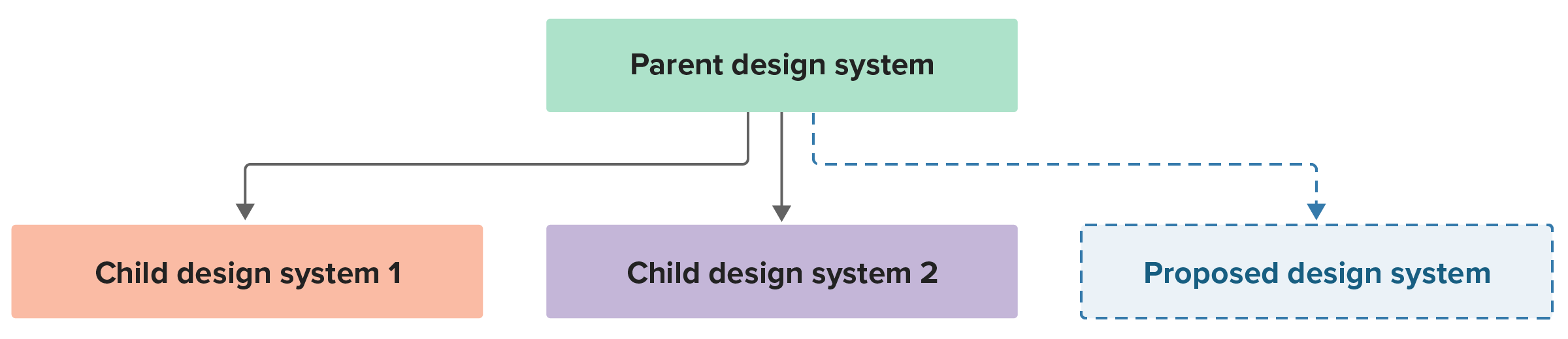
Updates made to the parent design system show up in child design systems, but the reverse is not true. The child design systems exist because they inform how two separate websites look and behave. These websites, however, are part of one larger organization, so they need to feel unified in a very high-level way.
It’s easy to assume that there’s perfect parity in features across every design system, but that’s not always the case. Sometimes striving for uniformity without considering the context of each design system’s needs can work against you. For example, one child design system may not need a component or component variant that another has, even if they are otherwise closely related.
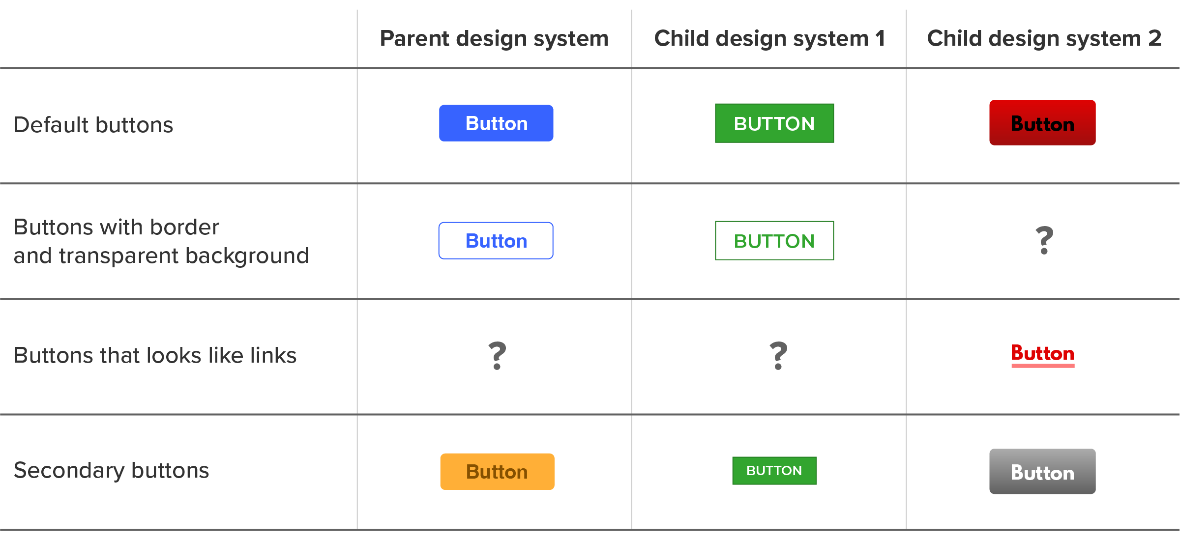
Design system audit: the complexity of button variants
Recently, I was tasked with conducting an audit of our button component instances. The goal was to create a better sense of cohesion and identify gaps in coverage across our parent and child design systems.
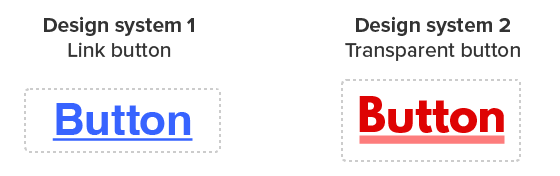
Buttons are a workhorse component—many variants are present for each design system. Each design system also uses a slightly different vocabulary to describe its variants, even if each system’s variant is functionally equivalent.
For example, one design system’s link button variant is effectively the same as another system’s transparent button variant:
Part of the reason behind conducting this audit was to build a foundation for some upcoming design token work.
Our tokens need a unified grammar that can encompass all three design systems and accommodate any future design systems that get added. This grammar provides us with an internal, standardized vocabulary to help coordinate cross-design system changes in a controllable and understandable way.
The notable bit here is accommodating – not overriding – the terminology that each design system and their stakeholders use. Honoring and speaking their language is an important aspect of successful communication and collaboration.
Presence, or lack thereof
In this audit, we uncovered button variants that existed in one child design system but not the sibling or parent design system:
Uncovering these gaps transforms variant coverage from an unknown unknown to a known unknown. This is an important thing to quantify!
Now it is no longer a question of if there are gaps, but why there are gaps.
The why compels us to do a bit of detective work. That typically means asking the child design system’s stakeholder about the history of the component and how it is used (and therefore distributed) in production websites.
Tying it together
Sometimes a gap is accidental. Sometimes it is intentional. Null allows us to express that intentionality:
| Parent design system | Child design system 1 | Child design system 2 |
|---|---|---|
| Variant A | Variant A | Variant A |
| Variant B | Variant B | null |
| null | null | Variant C |
| Variant D | Variant D | Variant D |
Null in this context means “this space intentionally left blank.” This is important because we as a species tend to give into our feelings of horror vacui and create things as a way to feel like we’ve solved a problem, regardless of if creating something is an effective solution.
Using null in a design system deliberately indicates we don’t need something to be added; we want to disincentivize someone from trying to fill in this perceived gap.
Keep in mind that design system maintainers may not always be present when decisions are being made, so we need to provide mechanisms to communicate intent in absentia. This can help design systems scale effectively across large, complex organizations like federal government agencies.
Explaining an absence
Somewhat ironically, the next step after an audit like this is to create something.
Chances are low that people using the design system may see the audit document we create. We do, though, have an opportunity to meet them where they are: in the design system’s documentation.
For a component variant, we might want a note on the component’s page about the discrepancy. You need to phrase it in such a way that helps with understanding and does not artificially create any extra confusion.

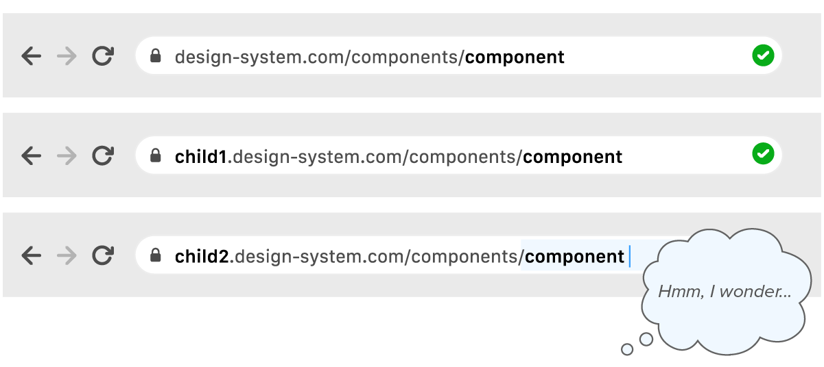
For an entire component, another option is to have a “ghost” page in your documentation that is not linked to in the rest of the documentation’s navigation. The page itself outlines why the component is not present, and potentially links to supporting material.
Ghost pages can be especially helpful when child design systems are in play, where someone can toggle between themes or systems on the component’s documentation page or anticipate the presence of a URL:
Both of these approaches augment things like release notes in that they help externalize and expose decisions. While release notes maintain a timeline of record, notes and ghost pages are intended to be more in the moment, meeting people where they are.
Explaining the gap
People instinctively like to create things to solve perceived problems and also fill apparent gaps in existing work.
Sometimes the problem is that the presence of a gap hasn’t been explained as being purposeful. By auditing the systems we work with, we’re able to both understand the larger context of what is and isn’t present and why. With that knowledge, we can create documentation that meets people where they are and that communicates intentional absences.
Related posts
- Developing a focus style for a themable design system
- Design systems in government: How to ease handoffs
- Design systems in government: When to start
- Design systems in government: Improving documentation for better collaboration
- Design systems in government: Communication is critical
- Design systems in government: Less can be more